Brand & logo
The owl, the teal, and the rules that come with them.
Everything you need to put iSmartExams somewhere: five lockups in SVG and PNG, the mark at three sizes, the palette with measured contrast, and plain answers about what you may claim. Free to use within the rules below.
The mark
The Scholar.
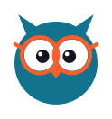
A geometric owl in the brand's teal, wearing orange spectacles. The glasses are the point: they carry study and focus, and they are what keep it from being the generic education owl. It is built from circles and triangles authored once in a single generator, so every file in this kit is produced from the same artwork and none of them can disagree.
Full
48px and up
The whole face: head, ear tufts, spectacles, eyes and beak.
Small
24 – 47px
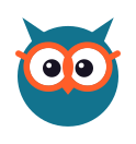
Spectacle and temple strokes thickened so they survive the shrink.

Micro
16 – 23px
Spectacles dropped entirely — bold eyes and beak, because at this size the glasses close into noise.
Shown at their real sizes above. Below 16px, use the micro mark on a solid tile — a full spectacled owl at 16px is mud, which is why the tier exists rather than a note asking you to be careful.
Lockups
Five arrangements, six colourways each.
Pick by the shape of the space you are filling. Each one comes in full colour, a version for dark grounds, and four single-colour versions for processes that can only print one ink.

Horizontal
The default. Headers, letterheads, anywhere wider than it is tall.

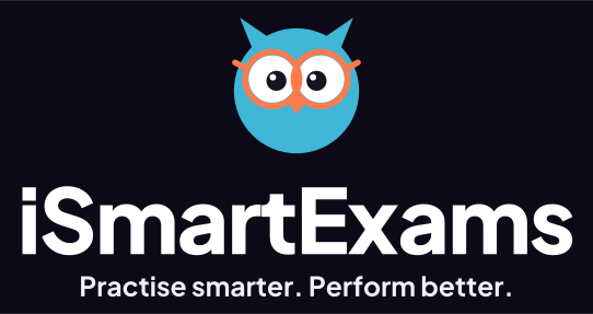
Horizontal with tagline
First impressions: a cover, a stand, the top of a deck.






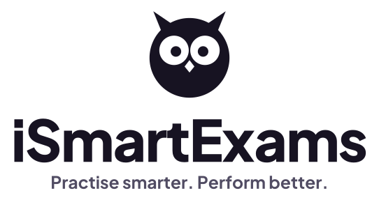
Stacked with tagline
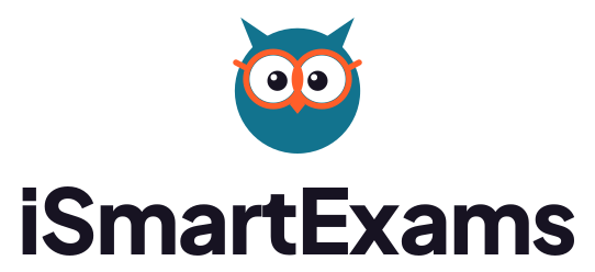
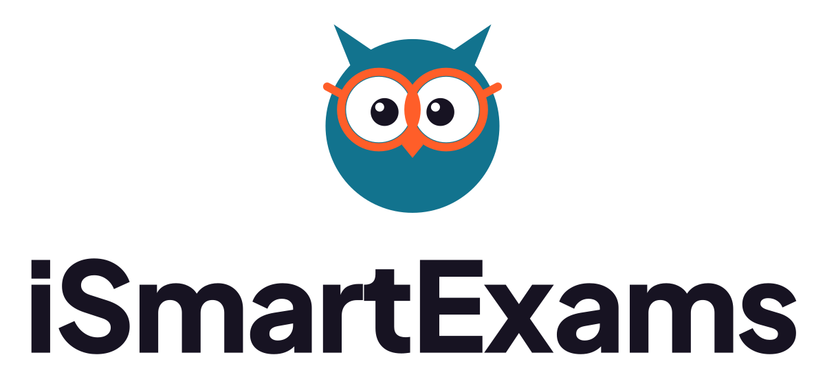
Posters and square social posts, where there is room to read.
Wordmark
Where the mark already appears beside it, or below about 20mm wide.

Everything at once
Lockups, the mark at every tier and colourway, app icons, favicons, share cards, splash art, the palette sheet and the type specimen. 348 files, all generated from vectors.
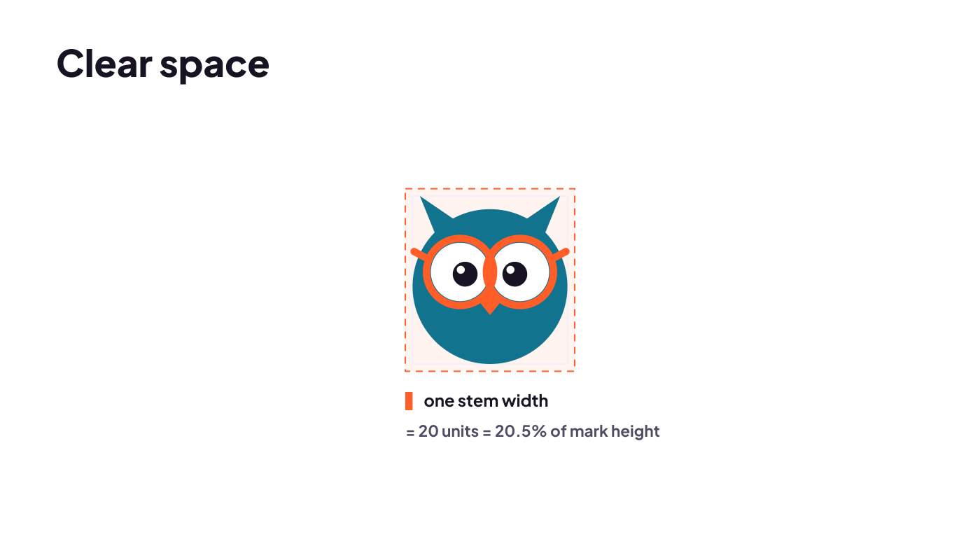
Download the kit (4.6 MB)Clear space is one stem width.
Keep that much free on every side — no text, no rules, no other logos. It works out at 20.5% of the mark's height, and tying the rule to a proportion of the artwork rather than to a number of pixels means it scales with the logo automatically, at any size, in any medium.
- Full mark
- 48px and up. Below that, the small and micro tiers
- Smallest of all
- 16px, as the micro tier on a solid tile
- Smallest print width
- About 20mm; below that use the small tier
- Clear space
- One stem width — 20.5% of the mark's height
- Safe on dark below
- 40% luminance — use the on-dark files
- Every file
- Vector, with the lettering already outlined
Colour
Five colours, and one of them is a trap.
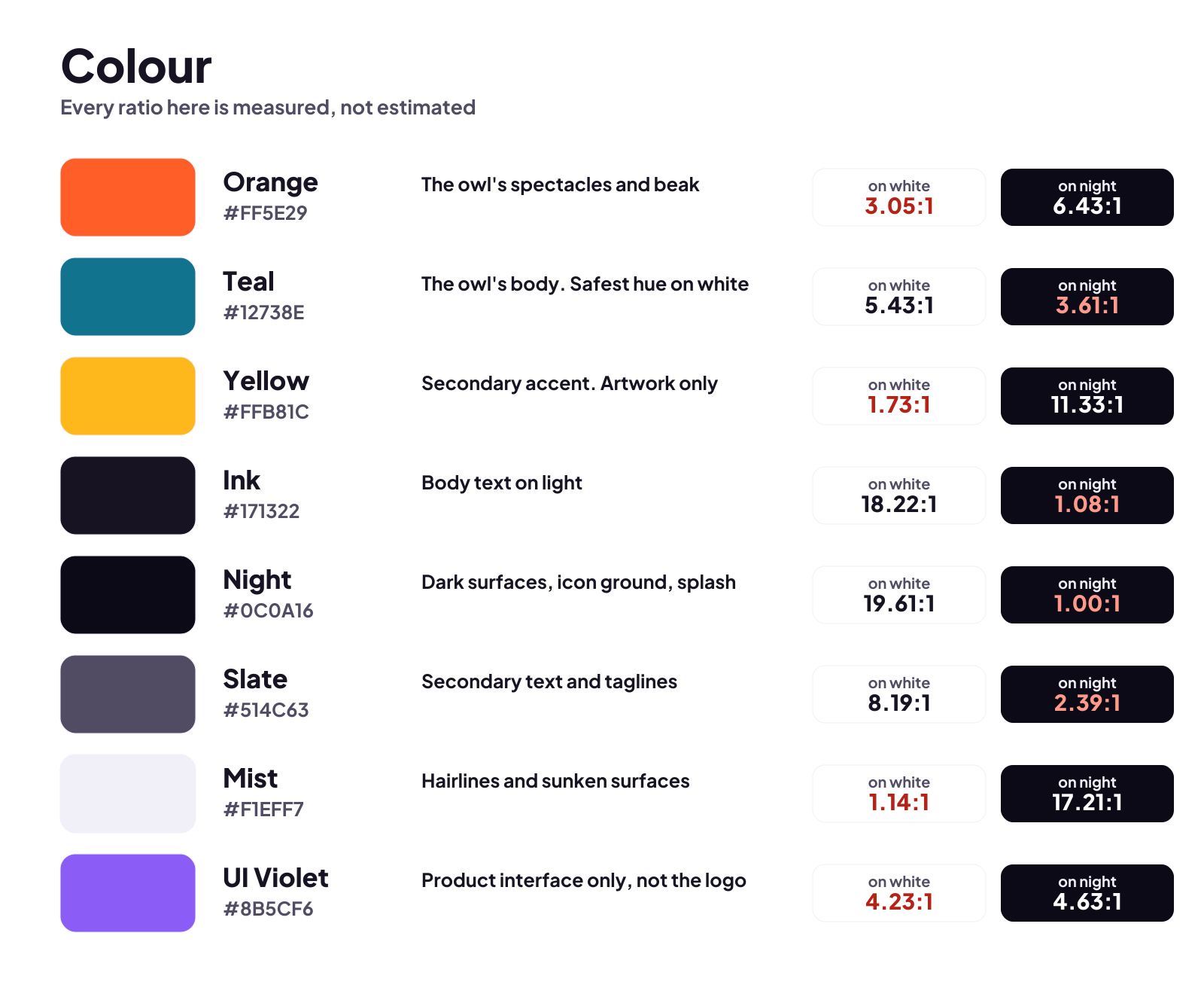
Contrast ratios here are measured against white and checked into the kit, not estimated. CMYK is an unprofiled conversion from RGB: good enough to specify, not good enough for a press run that has to match.
| Colour | HEX | RGB | CMYK | On white | |
|---|---|---|---|---|---|
| TealThe owl's body, and the interface. The only brand hue safe as text. | #12738E | 18, 115, 142 | 87 / 19 / 0 / 44 | 5.43:1Safe as text | |
| OrangeThe spectacles and the beak. The warm signal, used sparingly. | #FF5E29 | 255, 94, 41 | 0 / 63 / 84 / 0 | 3.05:1Artwork only | |
| YellowSecondary accent for artwork only. Never type, never on white. | #FFB81C | 255, 184, 28 | 0 / 28 / 89 / 0 | 1.73:1Artwork only | |
| InkBody text on light grounds, and the one-colour mark. | #171322 | 23, 19, 34 | 32 / 44 / 0 / 87 | 18.22:1Safe as text | |
| NightDark surfaces, the app's icon ground and the share cards. | #0C0A16 | 12, 10, 22 | 45 / 55 / 0 / 91 | 19.61:1Safe as text |
The yellow is the trap.
At 1.73:1 on white it is effectively invisible to anyone who needs contrast, so it is not in the mark at all any more and it is never type. It survives as an accent inside artwork, on dark grounds, where it reaches 11.3:1.
On dark, the teal changes.
#12738E manages only 3.61:1 on the night ground, so the on-dark colourway lifts the body to #3FB6D6 and clears 8.29:1. That is why there is a separate file rather than a note telling you to brighten it.
Aa Bb Cc
0123456789
The quick brown fox jumps over the lazy dog.
- Bold and ExtraBold
- Headings, buttons, numbers
- Regular and Medium
- Body text, labels, captions
Inter for everything we write.
The product, this website and the app all set Inter — one typeface for body and headings alike, because two made the same company look like two companies. It is a free Google font, so you can match it.
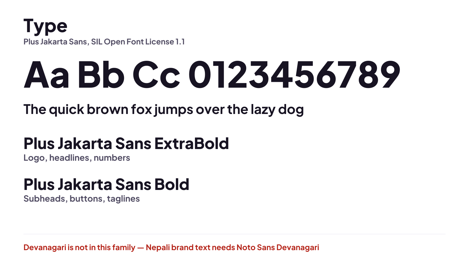
The wordmark is not Inter, and should not be. It is drawn lettering built from Plus Jakarta Sans ExtraBold outlines, and those outlines are baked into every SVG as paths — which is why a logo file renders correctly on a machine that has neither font installed, and why you cannot re-typeset the wordmark and get the same thing.
There is no Nepali lockup yet. The wordmark's family has no Devanagari glyphs, and the kit's build fails loudly rather than substituting a different typeface silently, so the Nepali version is unbuilt rather than quietly wrong. Ask us if you need one.
The name
iSmartExams. One word, small i, big S and E.
It is the thing people get wrong most often, and the one we care about most, because the name is what somebody types into a search box when they are trying to find us.
In running text
iSmartExams — one word, no space, no hyphen. Lower-case i even at the start of a sentence; if that reads badly, start the sentence differently.
The company
Lacspace Corporation Pvt. Ltd. builds it. Write the product name in product copy and the company name where the legal entity matters, such as a contract or an invoice.
Not these
iSmart Exams, ISmartExams, I-Smart Exams, Ismartexams, iSmartExam (no s). All of them end up somewhere else, or nowhere.
Every common misspelling, and what each one does, is written out on its own page. The tagline is “Practise smarter. Perform better.”, with the British spelling of practise, and short forms are in the kit.
Do and don't
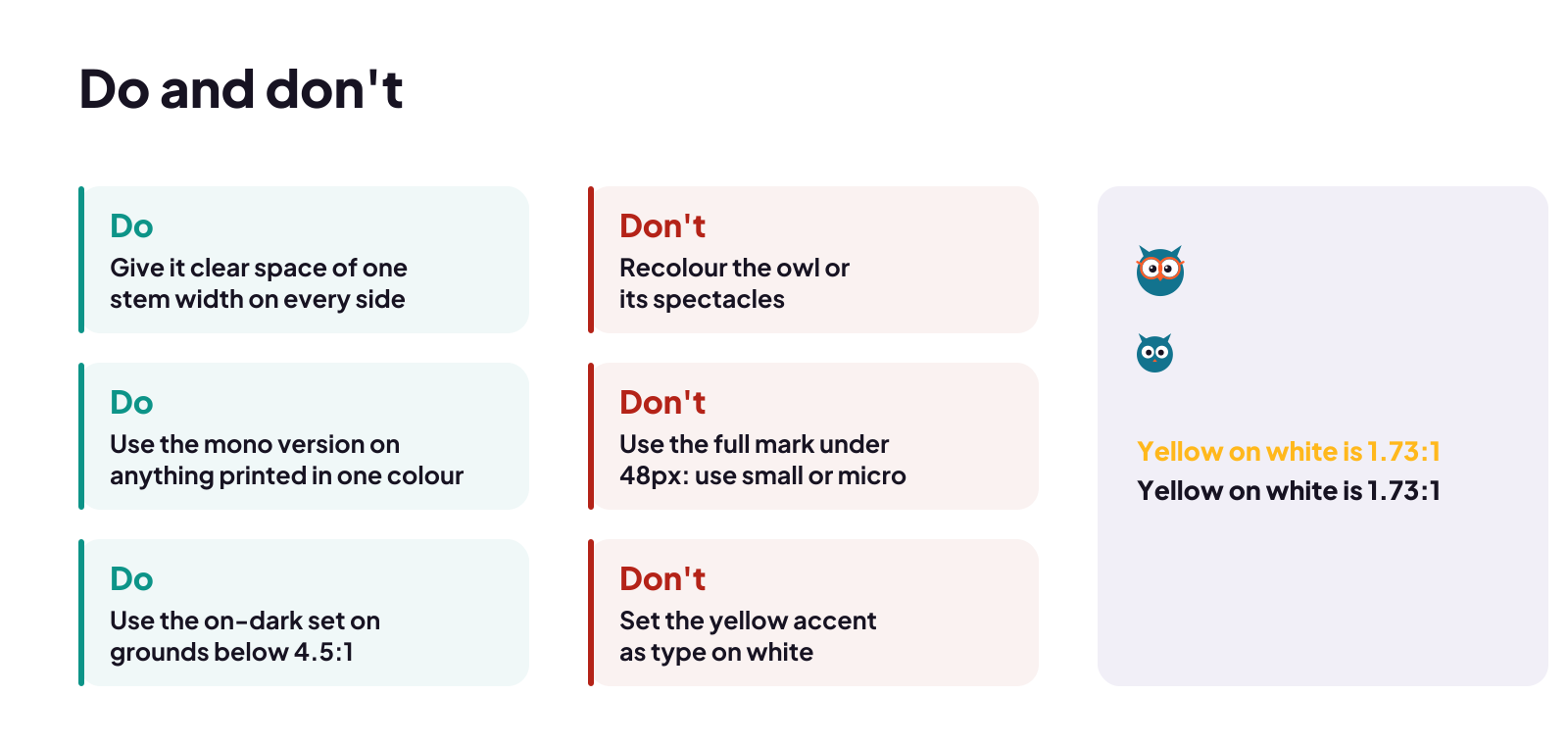
Six of each, and none of them are taste.
Each one is here because breaking it produces a visibly worse result, not because we prefer it that way.
Please do
- Use the SVG wherever the medium allows one. Every file here is vector, so it is sharp at any size and needs no font installed.
- Keep one stem width of clear space on every side — 20.5% of the mark's height. The rule is tied to the artwork, so it scales with it.
- Pick the tier that matches the size you are placing it at, not the one you happen to have open.
- Switch to the on-dark colourway on any ground darker than about 40% luminance — it lifts the teal to #3FB6D6, which clears 8:1 there.
- Use a mono file for anything one-colour: embroidery, screen print, cut vinyl, etching, a rubber stamp.
- Put the logo on a plain ground. If it has to sit on a photograph, use the white mono on a darkened area.
Please don't
- Do not recolour the mark. The teal body and orange spectacles are the identity; a blue owl is somebody else's.
- Do not stretch, squash, rotate, outline, emboss or drop-shadow it, and do not add a gradient.
- Do not place the full mark below 48px. That is what the small and micro tiers are for, and below 16px the micro mark needs a solid tile behind it.
- Do not set the yellow as text or on white — at 1.73:1 it is barely there, and that is measured, not an opinion.
- Do not re-typeset the wordmark. It is drawn lettering, not a font you can match.
- Do not rebuild the lockup yourself by placing the mark next to type, and do not put our mark inside your own.
The kit also carries these as a reference sheet, drawn at full size for printing and for handing to a designer: do-and-dont.svg and clearspace.svg.
What you may say
Use the logo freely. Do not borrow our authority.
The line is simple: say true things about using iSmartExams, and do not imply a relationship that does not exist. The second kind of claim misleads a learner who is choosing where to spend money, which is the part we mind.
You may
- Say that you practise, prepare or revise with iSmartExams, and link to us.
- Use the horizontal lockup, unaltered, to label that link or to illustrate an article about us.
- Show a screenshot of the app or portal in a review, a news piece or a classroom.
- Say that a certificate is an iSmartExams practice-exam certificate, and show it.
You may not
- Describe yourself as an iSmartExams partner, agent, affiliate, reseller or official centre unless we have agreed that in writing.
- Suggest that we endorse, certify, accredit or recommend you, your institute or your course.
- Present an iSmartExams certificate as a result from an exam board. It records how someone did on our mock exams; nothing more.
- Use the mark in your own logo, product name, app icon, domain or social handle, or in a way that suggests we built your thing.
- Alter, animate, recolour or crop the mark and keep calling it ours.
On certificates especially. An iSmartExams certificate records a score on an iSmartExams mock exam. It is not a result from NEB, a university, a licence council, Lok Sewa or any language exam board, and presenting it as one — in an advert, a prospectus or a visa file — is the one misuse we will always ask to have taken down. What a certificate is.
Trademark and permission.
“iSmartExams”, the Scholar owl mark and the lockups on this page are trademarks of Lacspace Corporation Pvt. Ltd.. This page is the permission: use them as described here and you do not need to ask us first.
Anything else — a co-branded lockup, merchandise, a partnership announcement, a modified mark, or any use that states or implies endorsement — needs our written permission, and we read those requests properly rather than refusing by default. We can also supply a press-ready conversion for a specific press, or a lockup at a size the kit does not include.
We may update these guidelines. Nothing here grants any right beyond use of the marks as described, and permission can be withdrawn where a use misleads learners.
Asking
One inbox, read by the team.
Tell us what you want to make and where it will appear. A mockup or a link answers most of our questions before we ask them.
Press or media: use the horizontal lockup and the share card in the kit, and write to the same address if you need something specific. We will not ask to approve your article.
In the kit
348 files, none of them traced.
Everything is generated from vectors by one builder, so each asset is sharp at any size and can be regenerated at any other. Nothing was upscaled or exported from a screenshot.
Lockups
Horizontal, stacked and wordmark, each with and without the tagline, SVG and PNG at 1x and 2x, plus the clear-space and do/don't sheets.
The mark
Three tiers, six colourways, four tiles. Mono files for one-colour processes.
App icons
iOS, Android adaptive, Play Store, and drop-in Expo assets.
Favicons
The full set, a real multi-resolution .ico, a web manifest and a paste-ready head snippet.
Share cards
Open Graph, Twitter, LinkedIn, the Play feature graphic and a square, light and dark.
Colour and type
The palette sheet with measured contrast, the type specimen, and tokens as JSON, CSS and TypeScript.
Questions
About using the brand.
Can I use the iSmartExams logo?
Which file should I use?
Why does the small logo look different from the big one?
Is there a Nepali version of the logo?
Can I print the logo?
What is the owl called?
Need something that is not here?
A size, a format, a press-ready conversion, or a lockup for a context we did not think of. Ask, and we will generate it from the same source rather than resizing a PNG for you.